In today’s data-driven world, having the right information at the right time is crucial. Power BI, Microsoft’s leading business analytics tool, transforms raw data into clear, interactive, and easy-to-understand reports. Whether you’re a factory operator, a production manager, or a CEO — Power BI helps you see more, know more, and do more.
Power BI reporting is a gamechanger because it allows teams to:
It connects easily with cloud platforms like Microsoft Azure, Excel, SQL databases, and IoT systems — making it the perfect tool for modern manufacturing environments.
Curious how these reports look in action? Below you can see the Power BI demo reports that let’s you explore real data examples, interactivity, and practical insights.
Here are just a few examples of other COREE OEE (Overall Equipment Effectiveness) reports we build at IoTabe — all designed to give you clear insights into your production process.
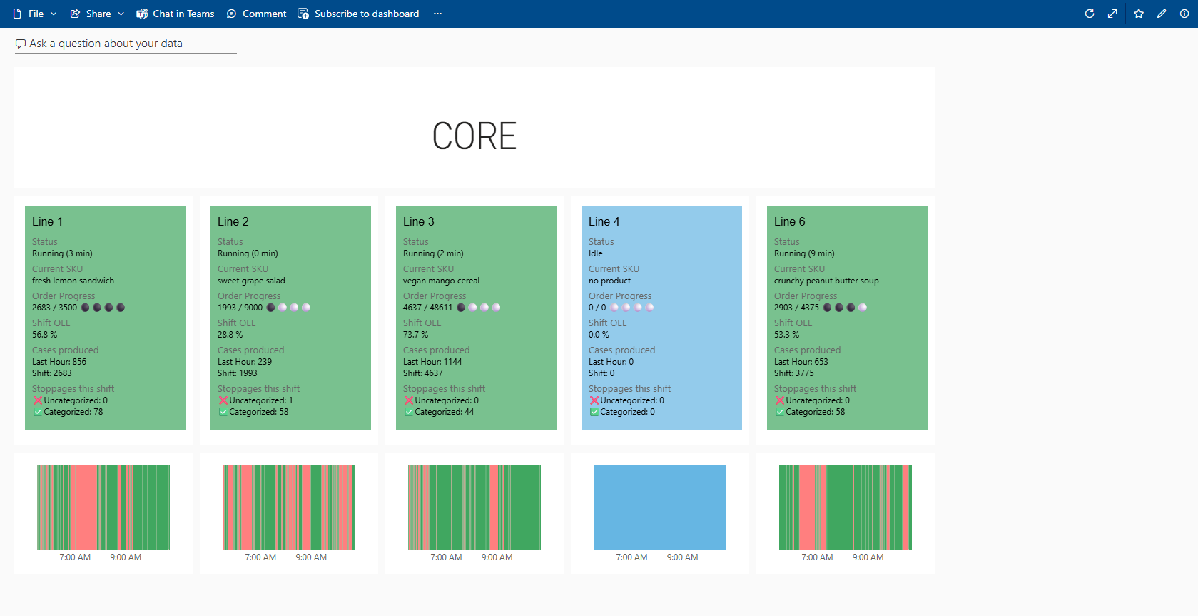
This Power BI dashboard displays live data from the current production shift, offering real-time visibility into efficiency (OEE), line status, order progress, and stoppages. With clear visuals and up-to-the-minute insights, it empowers users to respond quickly, optimize performance, and keep operations running smoothly.
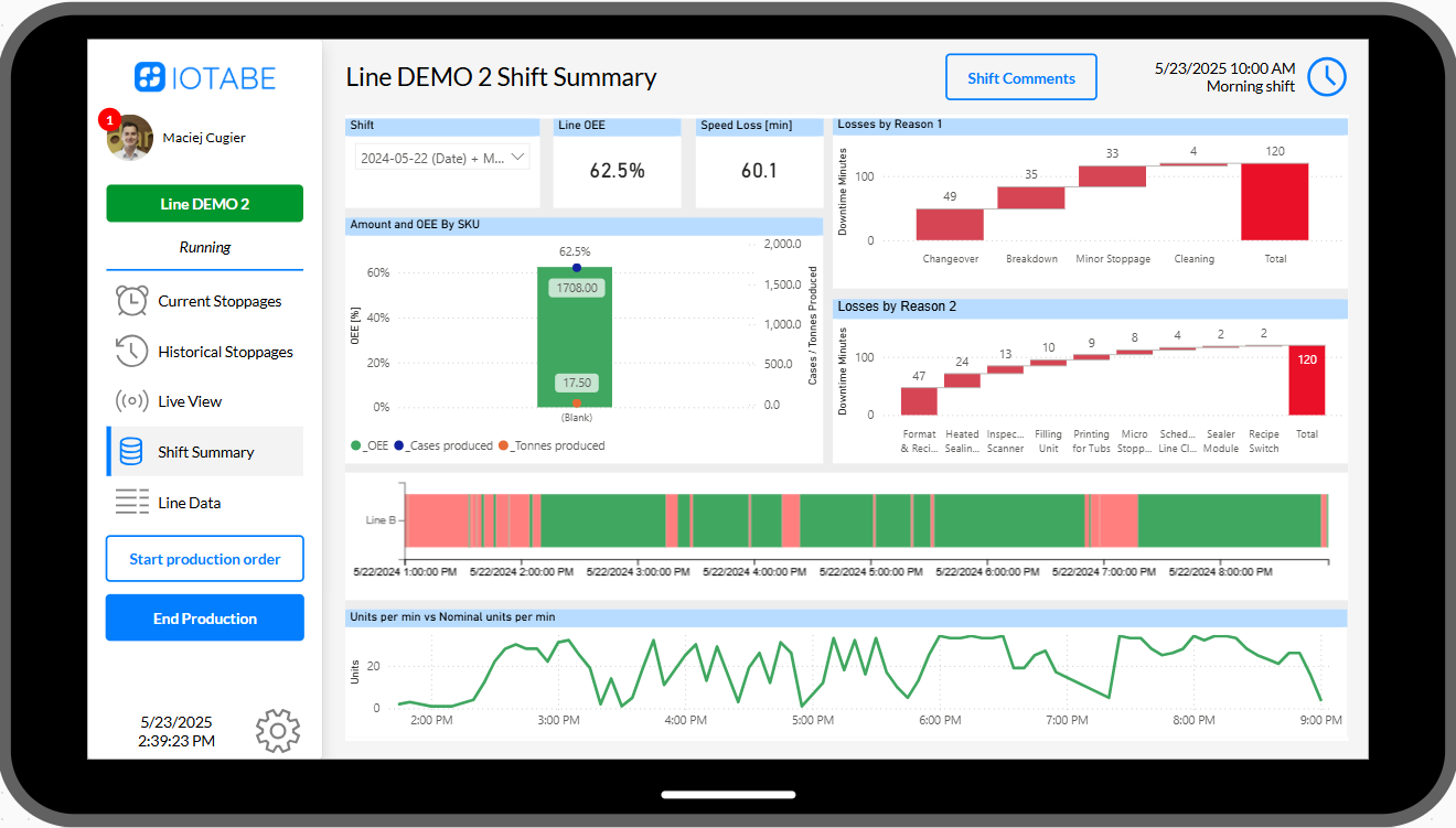
This Power BI shift summary report offers operators and teams a clear retrospective view of what happened during the current or previous shift—highlighting efficiency, downtime reasons, and production trends to support continuous improvement and better decision-making.
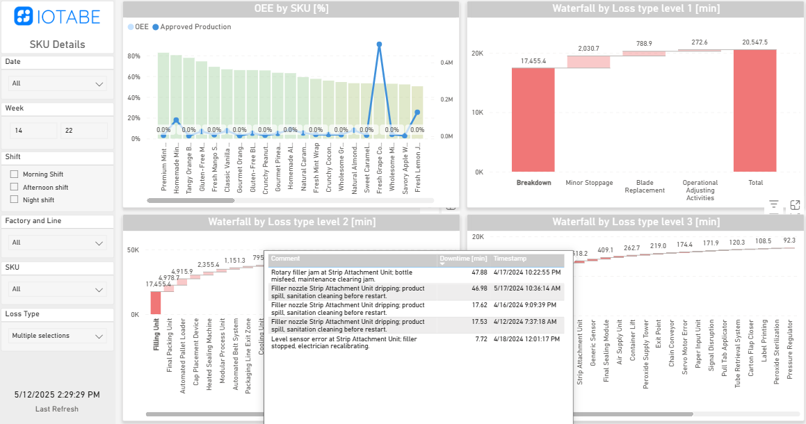
This interactive loss analysis report enables users to drill down from high-level stoppage categories to specific operator comments. With powerful visualizations and layered waterfall charts, it helps uncover root causes and prioritize the most impactful improvements across shifts and SKUs.
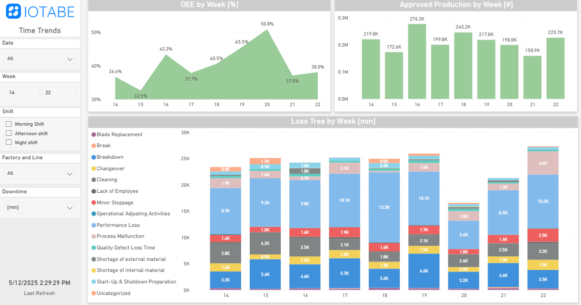
This time trends report tracks weekly changes in OEE, production volume, and downtime causes—helping teams spot patterns, measure improvements, and focus on the most pressing issues over time. It’s a powerful tool for driving continuous performance gains.